Webscraping
Using dplyr and ggplot for Visualization
I am still getting used to the idea of a few of these functions so if this seems all over the place, there is a reason for that!
I came across this post on r/dataisbeautiful and I was instantly convinced to give it a shot!
The method I used was a little bit convoluted and hacky. What I am going to show here is how to read data off of a website and then show you how the data looks, and how to plot it in the way we would like.
Further down the line when I am more comfortable with the complex, I can make a more detailed tutorial.
For now, we will be downloading the file hosted here
| Season | EpisodeNumber | Doctor | Title | Ratings | Quality |
|---|---|---|---|---|---|
| 1 | 1 | Ninth | Rose | 7.5 | Good |
| 1 | 2 | Ninth | The End of the World | 7.6 | Good |
| 1 | 3 | Ninth | The Unquiet Dead | 7.5 | Good |
| 1 | 4 | Ninth | Aliens of London | 7 | Regular |
| 1 | 5 | Ninth | World War Three | 7 | Regular |
| 1 | 6 | Ninth | Dalek | 8.7 | Great |
From our data set we can see that we have information on the following:
Season Number
Episode Number
Episode Title
IMDb User Rating
Categorical Rating
We can do a few things with this data. First, lets see which doctor has the most episodes.
| Doctor | n |
|---|---|
| Eleventh | 55 |
| Tenth | 42 |
| Twelfth | 27 |
| Thirteenth | 22 |
| Ninth | 13 |
The eleventh doctor wins out here!
Next it might be fun to see which season had the highest rating and then graph that.
# These are the custom colors we will be using for our ratings
dwcolor <-
  c("Bad"="red2", "Garbage" ="dodgerblue2",
    "Great" ="greenyellow", "Regular"="darkorange1",
    "Good" ="gold1")

doctorwho |>
  group_by(Season) |>
  ggplot(aes(as.factor(Season),Ratings)) +
  geom_point(aes(color = Quality),
             alpha = .2) +
  stat_summary(
    fun = "mean",
    geom = "point"
  ) +
  theme_minimal() +
  theme(legend.position = "none",
        axis.ticks = element_blank()) +
  labs(x="\nSeason",y="Rating\n",
       title="Doctor Who Average Season Rating\n",
       caption="(based on IMDb User Ratings)") +
  theme(
    plot.caption =
      element_text(
      face = "italic"),
    plot.title =
      element_text(
      face = "bold")
  ) +
  #scale_color_manual(values = dwcolor)
  scale_color_discrete()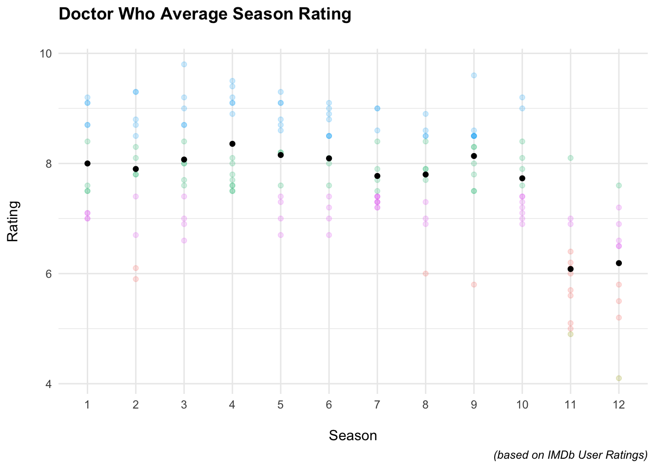
The takeaway from this is that the last two seasons were rated as the worst with Season 4 being rated as the best.
Another question might be which Doctor has the highest rated episodes?
Luckily we have a column with categorical information that tells us what ratings correspond to “Great”.
Here is the system used: < 5.0 = Garbage < 6.5 = Bad < 7.5 = Regular < 8.5 = Good < 10 = Great
So we could either filter(Ratings>8.5) or we could filter(Quality=="Great").
Grouping by Doctor ensures that the information of who the Doctor was that received that rating.
doctorwho %>%
  group_by(Doctor,Ratings) %>%
  filter(Quality=="Great") %>%
  group_by(Doctor) %>%
  count() %>%
  ggplot(aes(fct_reorder(Doctor,n),n,fill=Doctor,label = n)) +
    geom_bar(stat="identity") +
    theme_minimal()+
  coord_flip() +
    theme(
      axis.ticks = element_blank(),
      legend.position = "none",
      plot.caption = element_text(face = "italic"),
      axis.text.x = element_blank(),
      axis.text.y = element_text(face = "bold")
      ) +
    labs(x="",y="",
         title="Number of 'Great' Episodes: Per Doctor\n",
         captions="(based on IMDb User Ratings)") +
  scale_fill_viridis_d(alpha = .6) +
geom_label(color = "black") 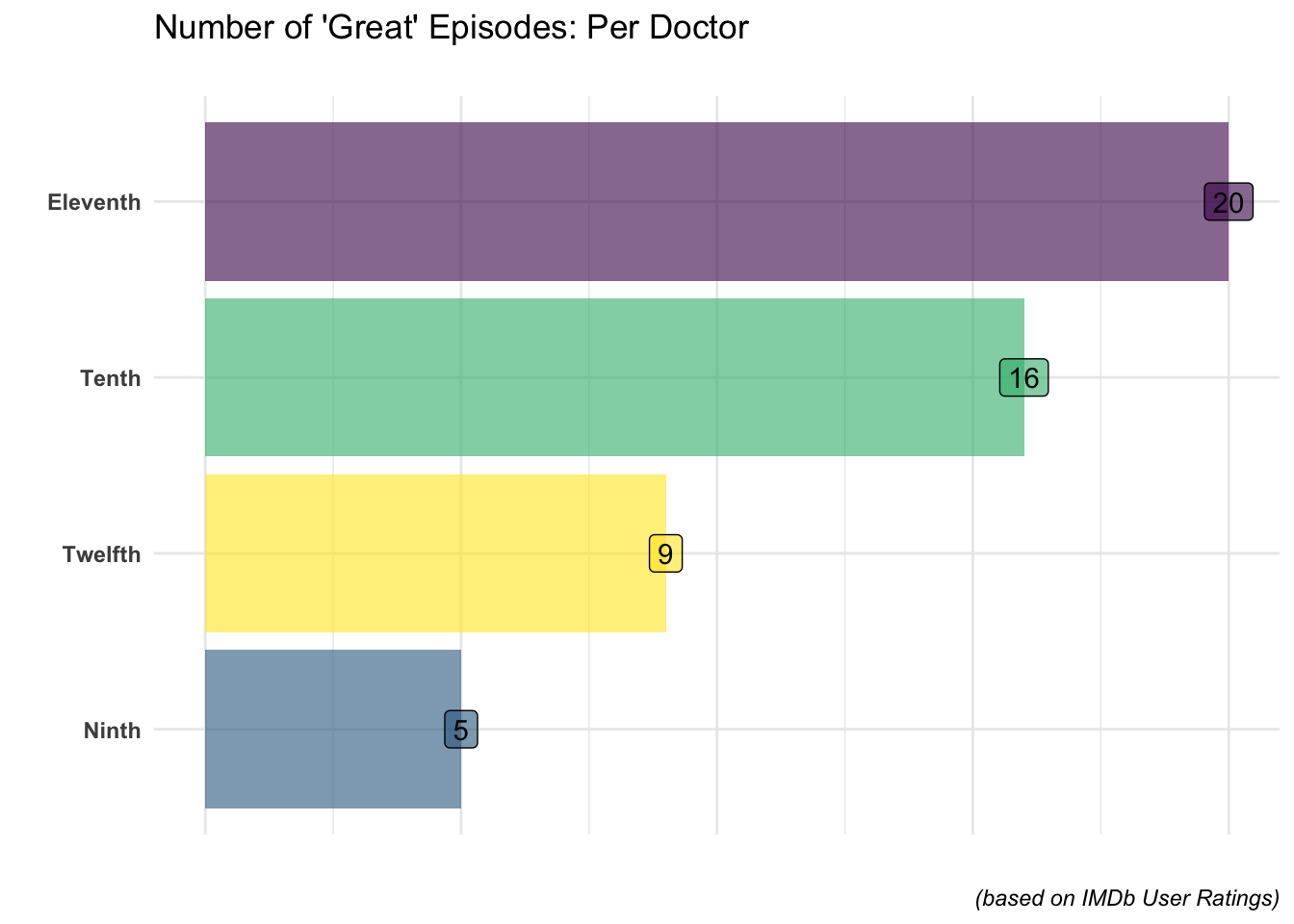
To be honest, no surprise here either!
Lastly, let’s construct a heatmap of all of the episodes of Doctor Who.
=
# Plotly is a package add-on that will make our graph interactive
# This is how it can be specially formatted
doctorwho_pltly <-
  doctorwho %>%
  mutate(text=
           paste0("Season: ", Season, "\n",
                  "Episode: ", EpisodeNumber,"\n",
                  "Title: ", Title, "\n",
                  "Doctor: ",Doctor))

library(ggtext)
p <-
  doctorwho %>%
  ggplot(aes(factor(Season),EpisodeNumber,fill=Quality)) +
    geom_tile(colour="black")+
    geom_text(aes(label=Ratings))+
    scale_fill_manual(values=dwcolor)+
  theme_minimal()+
  theme(axis.ticks = element_blank(),
        plot.subtitle = element_markdown()) +
    labs(x="Season\n",
         y="\nEpisode",
         title="Doctor Who IMDb Ratings: 2005-2020",
         subtitle = "Ratings of the <span style='color:#0072B2;'>good</span>
         and <span style='color:#009E73;'>bad</span>")

ggplotly(p)